
 (1)")
A well-structured display ad is essential. Follow these best practices to ensure your ad is effective:
- According to the Interactive Advertising Bureau, display ads should be clearly distinguishable from regular web page content, with defined borders to avoid confusion.
- Ad sizing must be flexible to accommodate different screen sizes.
Google provides various ad sizes, from half-page ads to leaderboards and large mobile banners. The top three ad sizes for performance are 300×250 (medium rectangle), 336×280 (large rectangle), and 728×90 (leaderboard).

To ensure your display ads are both strong and flexible to fit various formats, pay special attention to the top-performing sizes. Here’s how to structure your ads effectively by focusing on the fundamental elements:
Logo or Company Name: Ensure your brand is immediately recognizable.
Value Proposition: Clearly state the benefit or offer that will attract attention.
Image or Visual Representation: Use visuals that effectively represent your service or product.
Call to Action (CTA) Button: Include a clear and compelling CTA to prompt user engagement.
By incorporating these four main components, your display ads will be well-structured and optimized for success.
Arranging These Elements
Your value proposition and CTA are the most crucial elements. One company found that optimizing its landing page CTA led to a 245% increase in leads, highlighting the importance of a strong CTA.
Therefore, make your value proposition and CTA the most visually distinct elements. Place your logo on the sidelines, at the edge of your ad, and ensure your image doesn’t obscure any of the copy.
By following these principles, you can enhance your display ads and achieve better results.

In design thinking, color is crucial for capturing attention and evoking emotions. Your color scheme also becomes synonymous with your brand. For instance, when you think of Coca-Cola, red immediately comes to mind.
The psychology behind color is fascinating and important to consider when designing ads. Men and women, for example, have different color preferences. A study revealed that the most popular colors among men are blue (57%) and green (14%), while women favor blue (35%) and purple (23%).
Hence, you may decide to use a slightly different color palette depending on who your campaign is aimed at.
Particular industries also tend to favor particular colors. This study from Visual Capitalist shows the colors used by the top 20 brands for their logos, sorted by industry:
“We can see that many industries lean towards favoring particular colors, leveraging the psychological triggers these colors carry, both attracting us as consumers and representing the industry.”
In the communications industry, for instance, blue and black are the most popular colors. Incorporating these colors in display ads for this sector can help instill trust in your brand.


Ever heard of the KISS principle? No, it’s not about the 70’s rock band. KISS stands for Keep It Simple, Stupid. Originating in product design, this principle applies to design in any context.
Display ads are compact by nature. You can’t fit your entire brand story in a 300×250 ad, so you need to keep it simple. Your message must be clear and quick to grasp.
Google Marketing recommends the three C’s for creating effective display ads: they should be compelling, concise, and clear. This prevents overwhelming the viewer.
Take a look at this simple yet brilliant display ad from join.me:
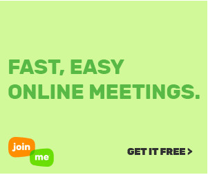
The value proposition and CTA are unmistakable. That’s exactly what you want. The three C’s—attention, brevity, and clarity—demand a design that immediately grabs attention, delivers a concise message, and provides a clear call to action.
For B2C ads, showcasing your product is crucial. However, you can maintain simplicity while doing so. Use high-resolution images that complement your message and CTA without overwhelming them.
Another aspect of simple design is ensuring consistency throughout the entire campaign. If a display ad leads to a landing page with a different image, color scheme, or typeface, it can confuse the viewer and diminish the overall experience.
In contrast, observe this banner ad example from Aha, where the message and design seamlessly match the landing page. This consistency enhances the user experience, leading to higher conversion rates. In fact, improving the user experience can result in a staggering increase in conversion rates, up to 400%.

You should never use images simply to fill space or because you feel obligated to include them in your display ad. While images are indeed essential in marketing, it’s crucial to understand that they should serve a purpose beyond mere decoration.
Images play a significant role in communication as they convey valuable information. This is why they are indispensable in marketing. Therefore, it’s essential to ensure that the images you use in your ads have a clear purpose.
For instance, the purpose of your image may be to showcase your product in its full glory, as demonstrated in this example from H&M:
Alternatively, you might use an image or graphic to enhance the visual appeal of your ad and make it more eye-catching 
Using custom imagery in this way is likely to spark the interest of the viewer. As a rule of thumb, you should avoid stock images. Design is all about creativity after all
The images in these ads effectively capture attention without overshadowing the ad’s message, keeping in line with the KISS principle. They create curiosity and intrigue, prompting viewers to learn more about the product or service being advertised. Wistia, for example, employs this strategy deliberately. Their simple display ads spark interest and drive users to landing pages with more detailed information:
(Image Source: landing-page-wistia-design-principles)
This approach has proven successful for Wistia, with their landing page boasting a conversion rate of 13%.
To replicate this success, showcase your products or entice viewers with captivating and distinctive images. However, ensure that your call-to-action (CTA) and value proposition remain prominently featured. After all, the ultimate goal is to generate clicks and drive engagement.